Skinet Inventory Tutorial
Creating re-usable select and textarea inputs
Our form only has text-inputs at the moment but for the description we would like a text-area and for the brands/types we need a select input. Just in case we need these types of inputs at a future point lets create re-usable versions of them.
Creating a re-usable Text Area input.
Create a new component for this by running the following command in the context of the client folder:
ng g c shared/components/text-area --skip-testsOpen the new text-area.component.ts and add the following code:
import { Component, Input, Self } from '@angular/core';
import { NgControl, FormControl, ReactiveFormsModule } from '@angular/forms';
import { MatFormField, MatError, MatLabel } from '@angular/material/form-field';
import { MatInput } from '@angular/material/input';

@Component({
  selector: 'app-text-area',
  standalone: true,
  imports: [
    ReactiveFormsModule,
    MatFormField,
    MatInput,
    MatError,
    MatLabel
  ],
  templateUrl: './text-area.component.html',
  styleUrl: './text-area.component.scss'
})
export class TextAreaComponent {
  @Input() label = '';

  constructor(@Self() public controlDir: NgControl) {
    this.controlDir.valueAccessor = this;
  }

  writeValue(obj: any): void {
  }

  registerOnChange(fn: any): void {
  }

  registerOnTouched(fn: any): void {
  }

  get control() {
    return this.controlDir.control as FormControl
  }
}
This is virtually identical to the text-input.component.ts.
Next, open this components template and add the following code:
<mat-form-field appearance="outline" class="w-full mb-4">
<mat-label>{{label}}</mat-label>
<textarea [formControl]="control" placeholder={{label}} matInput></textarea>
@if (control.hasError('required')) {
<mat-error>{{label}} is required</mat-error>
}
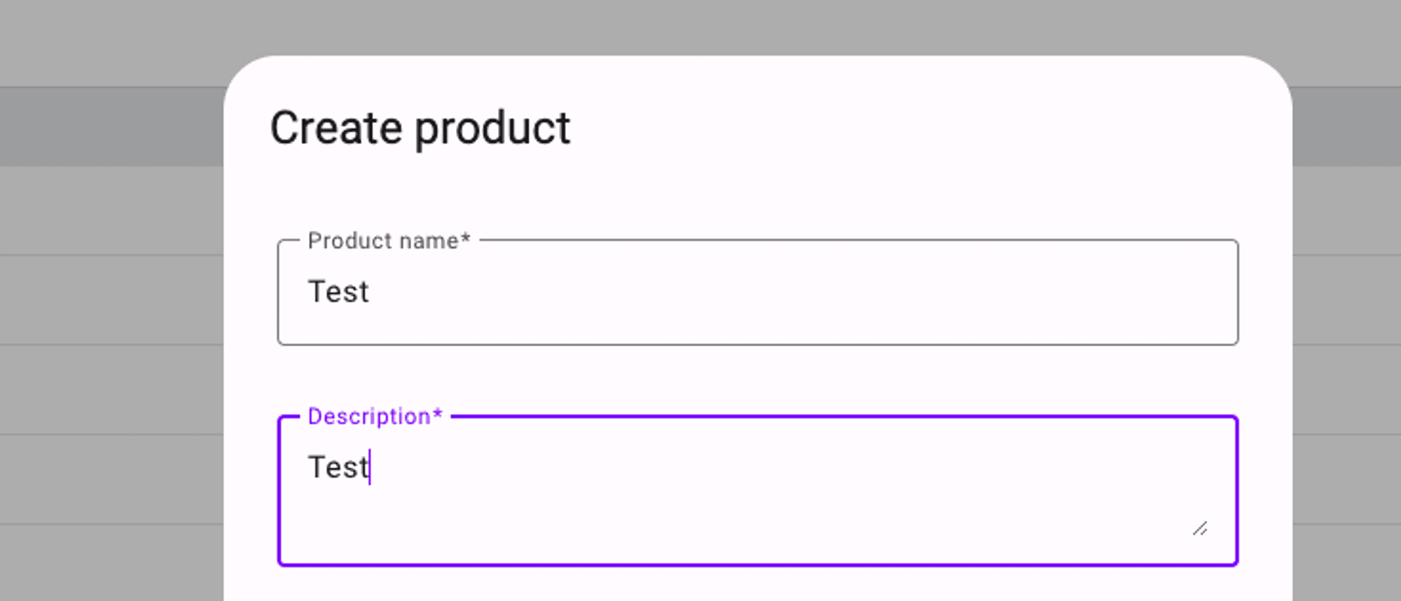
</mat-form-field>Again, this is virtually identical to the text-input with just the <input> changed to the <textarea>.
Next, use this new component in the product-form.component.html for the description field:
<app-text-area label="Description" formControlName="description" />Also ensure you add the import for this in the product-form.component.ts imports array:
import { TextAreaComponent } from "../../../shared/components/text-area/text-area.component";

@Component({
  selector: 'app-product-form',
  standalone: true,
  imports: [
    // other imports
    TextAreaComponent
],
You should be able to test this now in the form when you open it:
Creating the select-input re-usable component.ts
Create another new component by running the following command:
ng g c shared/components/select-input --skip-testsOpen the new select-input.component.ts and add the following code:
import { Component, Input, Self } from '@angular/core';
import { ControlValueAccessor, NgControl } from '@angular/forms';
import { MatFormFieldModule } from '@angular/material/form-field';
import { MatSelectChange, MatSelectModule } from '@angular/material/select';

@Component({
  selector: 'app-select-input',
  standalone: true,
  imports: [
    MatFormFieldModule,
    MatSelectModule
  ],
  templateUrl: './select-input.component.html',
  styleUrl: './select-input.component.scss'
})
export class SelectInputComponent implements ControlValueAccessor {
  @Input() label = '';
  @Input() options: string[] = [];

  value: string = '';
  onChange: any = () => {};
  onTouched: any = () => {};

  constructor(@Self() public controlDir: NgControl) {
    this.controlDir.valueAccessor = this;
  }

  onSelect(event: MatSelectChange) {
    this.value = event.value;
    this.onChange(this.value);
  }

  writeValue(value: any): void {
    this.value = value;
  }

  registerOnChange(fn: any): void {
    this.onChange = fn;
  }

  registerOnTouched(fn: any): void {
    this.onTouched = fn;
  }

}
This one is a bit more involved as we need to accept a string[] of options to be selected. We also create an onSelect() method that accepts the selected value which we use with the form controls onChange() method. We also specify a property for the ‘value’ which we use in 2-way binding with the component template.
Next, open the template and add the following code:
<mat-form-field appearance="outline" class="w-full mb-4">
    <mat-label>{{label}}</mat-label>
    <mat-select (selectionChange)="onSelect($event)" [(value)]="value">
        @for (option of options; track $index) {
        <mat-option [value]="option">{{option}}</mat-option>
        }
    </mat-select>
</mat-form-field>
In this code we use the <mat-select> and are using the onSelect() method with the (selectionChange) event from <mat-select>. We are also using 2 way binding here with the [(value)] being set to the value which we define in the component code.
Next, open the product-form.component.ts
We need to get a list of types and brands from the shop.service.ts so inject this into the component:
shopService = inject(ShopService);If we review the code in the shop.service.ts then we can see that we are subscribing to this inside the service and storing the values for these in the service too which provides client side caching functionality.
  export class ShopService {
	  baseUrl = environment.apiUrl;
	  private http = inject(HttpClient);
	  types: string[] = [];
	  brands: string[] = [];

	  // other code omitted

	  getBrands() {
	    if (this.brands.length > 0) return;
	    return this.http.get<string[]>(this.baseUrl + 'products/brands').subscribe({
	      next: response => this.brands = response,
	    })
	  }

	  getTypes() {
	    if (this.types.length > 0) return;
	    return this.http.get<string[]>(this.baseUrl + 'products/types').subscribe({
	      next: response => this.types = response,
	    })
	  }
So we can use this in the product-form.component.ts but we do need to make sure we call the getBrands() and getTypes() methods just in case they are not already cached in the service. Update the product-form.component.ts with the following code:
  // product-form.component.ts

  ngOnInit(): void {
    this.initializeForm();
    setTimeout(() => {
      this.loadBrandsAndTypes();
    })
  }

  // other methods and code omitted

  loadBrandsAndTypes(): void {
    this.shopService.getBrands();
    this.shopService.getTypes();
  }
In this code we create a method to call the 2 shop.service methods to loadBrandsAndTypes() and then in the ngOnInit() we call this method. We wrap this in a setTimeout() as the Angular change detection will show warnings in the chrome dev tools console as we will not have these when the form first loads up. This simply prevents the warnings here.
Next, open up the product-form.component.html and update the fields for the brands and the types:
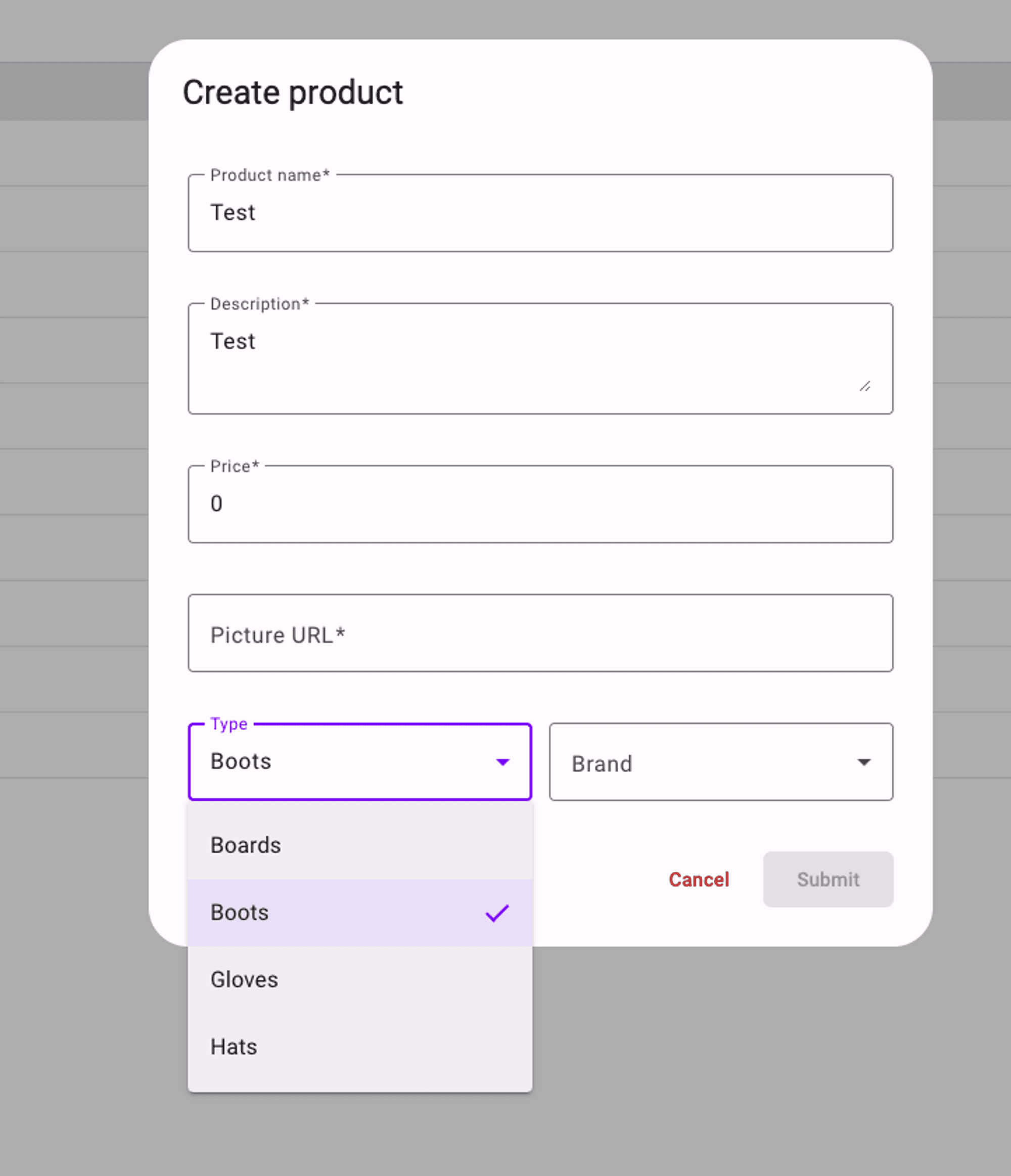
    <div class="flex justify-between w-full gap-3">
      <app-select-input label="Type" formControlName="type" [options]="shopService.types" class="w-full" />
      <app-select-input label="Brand" formControlName="brand" [options]="shopService.brands" class="w-full" />
    </div>
Ensure you import the SelectInputComponent into the product-form.component.ts imports array:
We pass the brands and types using the [options] input property. We also need to give this the ‘w-full’ class to ensure it takes up its full available width here. If you test this now you should see that you have the select input available for the brands and types:
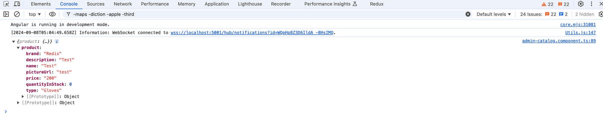
Give the form another test by populating the fields and you should see the following output in the chrome dev tools console:
Next, we will test the form functionality and enable editing of existing products too.
Comments
Loading comments...