Skinet Inventory Tutorial
Creating a re-usable table component
Pre-requisites for this tutorial
In order to follow along with this tutorial you will need to have the completed project from the related course that covers how to build this project, the Skinet course. Alternatively you can run the completed project locally on your computer by following the set up tutorials here. The code provided to build this project is all taught and explained in the training course here.
It is expected you have the knowledge gained from building the project in the course for this tutorial series, but you can still follow along without completing the course.
Please ensure you have the project running in development mode and you can login with the admin account using the following credentials:
username: admin@test.com
password: Pa$$word
Browse to the admin page and you should see something like this:
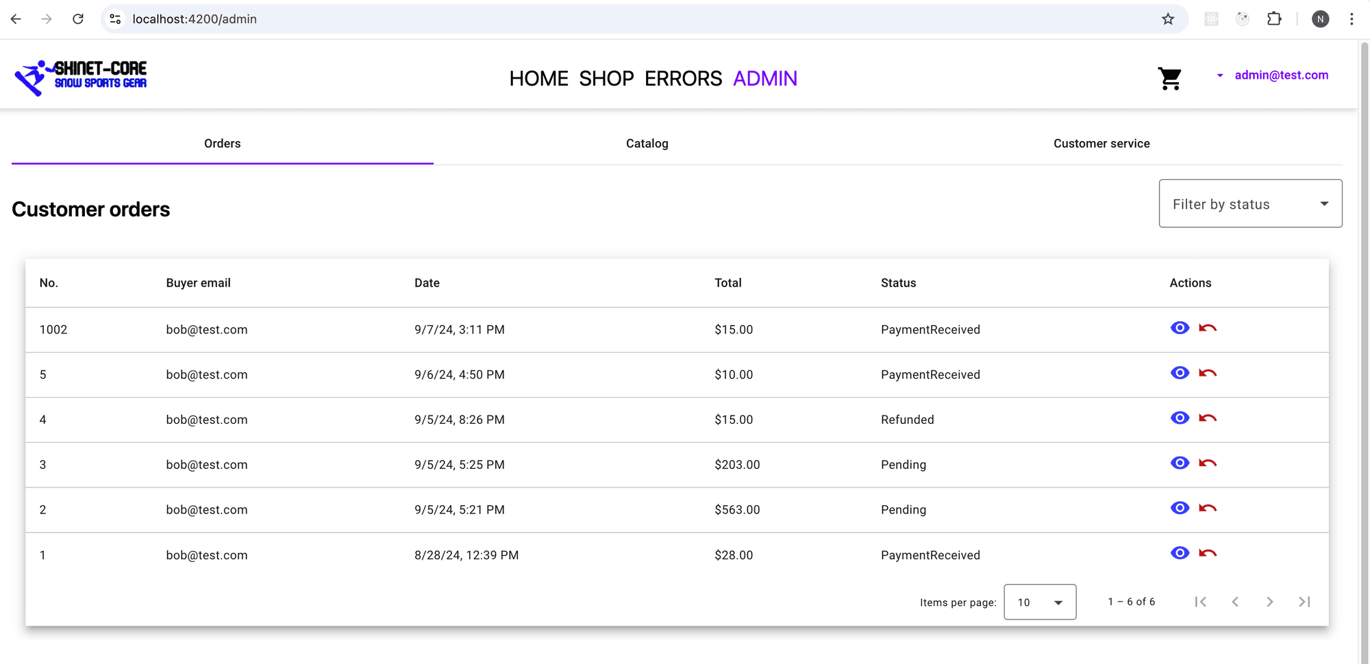
The Catalog tab just has placeholder text at the moment, but this is the feature we will work on in this tutorial!
Adding the components we need
In this set of tutorials we are going to create a simple inventory system for our e-commerce store and will implement the following in this lesson:
- An admin catalog component which will display the products in tabular form.
- A re-usable table which we will use for both the admin orders tab as well as the products tab.
Open the terminal and create the following components using the Angular CLI. Ensure you are in the context of the client folder (root of the angular app) when you use these commands:
ng g c shared/components/custom-table --skip-tests
ng g c features/admin/admin-catalog --skip-tests
ng g c features/admin/admin-orders --skip-tests
Adding a re-usable table component
Currently we just have a single admin component with an angular material table for the orders table we are using to issue refunds. The angular material table is somewhat tricky to use as a shared table component so we will simplify things and just use a tailwind css table as our shared table here.
Open the custom-table.component.ts and add the following code:
import { CommonModule } from '@angular/common';
import { Component, Input, Output, EventEmitter } from '@angular/core';
import { MatIcon } from '@angular/material/icon';
import { MatPaginatorModule, PageEvent } from '@angular/material/paginator';
import { MatTooltip } from '@angular/material/tooltip';

@Component({
  selector: 'app-custom-table',
  standalone: true,
  imports: [
    CommonModule,
    MatTooltip,
    MatIcon,
    MatPaginatorModule
  ],
  templateUrl: './custom-table.component.html',
  styleUrls: ['./custom-table.component.scss']
})
export class CustomTableComponent {
  @Input() columns: { field: string, header: string, pipe?: string, pipeArgs?: any }[] = [];
  @Input() dataSource: any[] = [];
  @Input() actions: { label: string, icon: string, tooltip: string, action: (row: any) => void, disabled?: (row: any) => boolean }[] = [];
  @Input() totalItems: number = 0;
  @Input() pageSize: number = 5;
  @Input() pageIndex: number = 0;

  @Output() pageChange = new EventEmitter<PageEvent>();

  onPageChange(event: PageEvent) {
    this.pageIndex = event.pageIndex;
    this.pageSize = event.pageSize;
    this.pageChange.emit(event);
  }

  onAction(action: (row: any) => void, row: any) {
    action(row);
  }

  getCellValue(row: any, column: any) {
    const value = row[column.field];
    if (column.pipe === 'currency') {
      return new Intl.NumberFormat('en-US', { style: 'currency', currency: column.pipeArgs || 'USD' }).format(value);
    }
    if (column.pipe === 'date') {
      return new Date(value).toLocaleDateString('en-US', column.pipeArgs);
    }
    return value;
  }
}
This component has the following features:
Inputs:
- columns: Array of column definitions (field name, header, optional formatting pipe, and arguments).
- dataSource: The array of data to be displayed in the table.
- actions: Array of actions (buttons) for each row, each containing label, icon, tooltip, and an action callback.
- totalItems: Total number of items for pagination.
- pageSize: Number of rows to display per page.
- pageIndex: Current page index.
Outputs:
- pageChange: Event emitter that outputs a PageEvent (page change event).
Methods:
- onPageChange(event: PageEvent): Updates pageIndex and pageSize when a pagination event occurs and emits the updated event.
- onAction(action, row): Calls the specified action on the given row (e.g., delete, edit).
- getCellValue(row, column): Formats the cell value based on the column’s pipe (e.g., format as currency or date).
This component is designed to be flexible, with customizable columns and actions, and also handles pagination and formatted display of data.
Next, open up the template for this component and add the following code:
<div class="p-4">
    <table class="min-w-full bg-white border border-gray-300">
      <thead>
        <tr class="border-b bg-gray-200">
          <th *ngFor="let column of columns" class="py-2 px-4 text-left">{{ column.header }}</th>
          <th class="py-2 px-4 text-left" *ngIf="actions.length">Actions</th>
        </tr>
      </thead>
      <tbody>
        <tr *ngFor="let row of dataSource" class="border-b">
          <td *ngFor="let column of columns" class="py-2 px-4">{{ getCellValue(row, column) }}</td>
          <td class="py-2 px-4" *ngIf="actions.length">
            <div class="flex gap-2">
              <ng-container *ngFor="let action of actions">
                <button
                  mat-icon-button
                  matTooltip="{{ action.tooltip }}"
                  [disabled]="action.disabled ? action.disabled(row) : false"
                  (click)="onAction(action.action, row)">
                  <mat-icon>{{ action.icon }}</mat-icon>
                </button>
              </ng-container>
            </div>
          </td>
        </tr>
      </tbody>
    </table>

    <mat-paginator
      [length]="totalItems"
      [pageSize]="pageSize"
      [pageIndex]="pageIndex"
      [pageSizeOptions]="[5, 10, 20]"
      (page)="onPageChange($event)"
      class="mt-4 bg-white"
    >
    </mat-paginator>
  </div>
This is a fairly standard tailwind css table. We loop over the columns to provide the column headers which we receive as in Input from the consumer of this component. We also conditionally add a column if actions are provided to go in the ‘action’ column.
In the <tbody> we loop over the ‘dateSource’ (array of data we pass into the component as an Input prop) and then in the <td> we loop over the columns. We use the getCellValue() method as this will allow us to use functionality such as the ‘date’ pipe or the ‘currency’ pipe in the column if we need it. In the second <td> we again check to see if any ‘actions’ have been passed as Input props to this component, and if so loop over the actions and display the buttons for each action specified.
We also include the <mat-paginator> to, well, paginate the data.
Using the re-usable table
We will use the new table to replace the existing angular material table we used in the main part of the course. As mentioned, the angular material table was tricky to use as a re-usable component. Not impossible of course, but the amount of code required to achieve the same functionality as above was… lots, and a little more complex than I would like for what I intend to be a straightforward demo.
Open the admin-orders.component.ts
We will be refactoring moving the code from the admin.component.ts into the admin-orders.component.ts here so the admin-orders.component should have the following code after you move it:
import { Component, inject, OnInit } from '@angular/core';
import { AdminService } from '../../../core/services/admin.service';
import { Order } from '../../../shared/models/order';
import { OrderParams } from '../../../shared/models/orderParams';
import { MatPaginatorModule, PageEvent } from '@angular/material/paginator';
import { DialogService } from '../../../core/services/dialog.service';
import { MatTooltip } from '@angular/material/tooltip';
import { MatIcon } from '@angular/material/icon';
import { CommonModule } from '@angular/common';
import { CustomTableComponent } from "../../../shared/components/custom-table/custom-table.component";
import { Router } from '@angular/router';

@Component({
  selector: 'app-admin-orders',
  standalone: true,
  imports: [
    MatPaginatorModule,
    MatTooltip,
    MatIcon,
    CommonModule,
    CustomTableComponent
],
  templateUrl: './admin-orders.component.html',
  styleUrls: ['./admin-orders.component.scss']
})
export class AdminOrdersComponent implements OnInit {
  orders: Order[] = [];
  private adminService = inject(AdminService);
  private dialogService = inject(DialogService);
  private router = inject(Router);
  orderParams = new OrderParams();
  totalItems = 0;

  columns = [
    { field: 'id', header: 'No.' },
    { field: 'buyerEmail', header: 'Buyer Email' },
    { field: 'orderDate', header: 'Order Date', pipe: 'date', pipeArgs: { year: 'numeric', month: 'short', day: 'numeric' } },
    { field: 'total', header: 'Total', pipe: 'currency', pipeArgs: 'USD' },
    { field: 'status', header: 'Status' }
  ];

  actions = [
    {
      label: 'View',
      icon: 'visibility',
      tooltip: 'View Order',
      action: (row: any) => {
        this.router.navigateByUrl(`/orders/${row.id}`)
      }
    },
    {
      label: 'Refund',
      icon: 'undo',
      tooltip: 'Refund Order',
      disabled: (row: any) => row.status === 'Refunded',
      action: (row: any) => {
        this.openConfirmDialog(row.id);
      }
    }
  ];

  ngOnInit(): void {
    this.loadOrders();
  }

  loadOrders() {
    this.adminService.getOrders(this.orderParams).subscribe({
      next: response => {
        if (response.data) {
          this.orders = response.data;
          this.totalItems = response.count;
        }
      }
    });
  }

  onPageChange(event: PageEvent) {
    this.orderParams.pageNumber = event.pageIndex + 1;
    this.orderParams.pageSize = event.pageSize;
    this.loadOrders();
  }

  onAction(action: (row: any) => void, row: any) {
    action(row);
  }

  async openConfirmDialog(id: number) {
    const confirmed = await this.dialogService.confirm(
      'Confirm refund',
      'Are you sure you want to issue this refund? This cannot be undone'
    );
    if (confirmed) this.refundOrder(id);
  }

  refundOrder(id: number) {
    this.adminService.refundOrder(id).subscribe({
      next: order => {
        this.orders = this.orders.map(o => o.id === id ? order : o);
        this.loadOrders(); // Update displayed data after refund
      }
    });
  }
}
Of course there are some extras in this version of the code, specifically the columns[] and the actions[], as well as the addition of the onAction() method.
The columns:
  columns = [
    { field: 'id', header: 'No.' },
    { field: 'buyerEmail', header: 'Buyer Email' },
    { field: 'orderDate', header: 'Order Date', pipe: 'date', pipeArgs: { year: 'numeric', month: 'short', day: 'numeric' } },
    { field: 'total', header: 'Total', pipe: 'currency', pipeArgs: 'USD' },
    { field: 'status', header: 'Status' }
  ];
These specify the same columns we had in the original table, but since we are passing these to the custom-table component we created and we are not in the context of an angular template we need an alternative way to specify the date and currency pipes so we add them as object properties in this columns array for handling by the getCellValue() method in the custom-table component.
The actions:
  actions = [
    {
      label: 'View',
      icon: 'visibility',
      tooltip: 'View Order',
      action: (row: any) => {
        this.router.navigateByUrl(`/orders/${row.id}`)
      }
    },
Each action is surfaced as a button in the custom-table as an icon button. Each action has an action callback function which will take in the ‘row’ as a paramater and execute whatever functionality we need. The ‘row’ in this case is the ‘order’.
The onAction() method:
  onAction(action: (row: any) => void, row: any) {
    action(row);
  }
This is designed to trigger the action associated with a specific table row when a user interacts with an action button. When an action is clicked (such as “View” or “Refund”) in the table, the onAction() method is called. This method simply executes the action() callback, passing the specific row of data for the corresponding order.
Next, open the template for this component and add the following code:
<div class="text-2xl font-semibold mt-4">
    Customer orders
</div>

<app-custom-table
  [columns]="columns"
  [dataSource]="orders"
  [actions]="actions"
  [totalItems]="totalItems"
  [pageSize]="orderParams.pageSize"
  (pageChange)="onPageChange($event)"
></app-custom-table>
Here we make use of our custom-table, passing it the columns, the orders, the actions and the metadata needed for the pagination.
Next, open up the admin.component.ts and clean up any unused code. This is what you should have:
import { Component } from '@angular/core';
import {MatTabsModule} from '@angular/material/tabs';
import { AdminOrdersComponent } from "./admin-orders/admin-orders.component";

@Component({
  selector: 'app-admin',
  standalone: true,
  imports: [
    MatTabsModule,
    AdminOrdersComponent
],
  templateUrl: './admin.component.html',
  styleUrl: './admin.component.scss'
})
export class AdminComponent {

}
Open up the template and replace the existing code with the following:
<div class="min-h-screen">
    <mat-tab-group class="bg-white">
        <mat-tab label="Orders">
            <app-admin-orders />
        </mat-tab>
        <mat-tab label="Catalog">
            Catalog goes here
        </mat-tab>
        <mat-tab label="Customer service">
            Customer service
        </mat-tab>
    </mat-tab-group>
</div>
Browse to the admin page and you should be back to where you started, albeit with a simpler tailwind table, but this will make it easier for us going forward. Ensure you see the following:
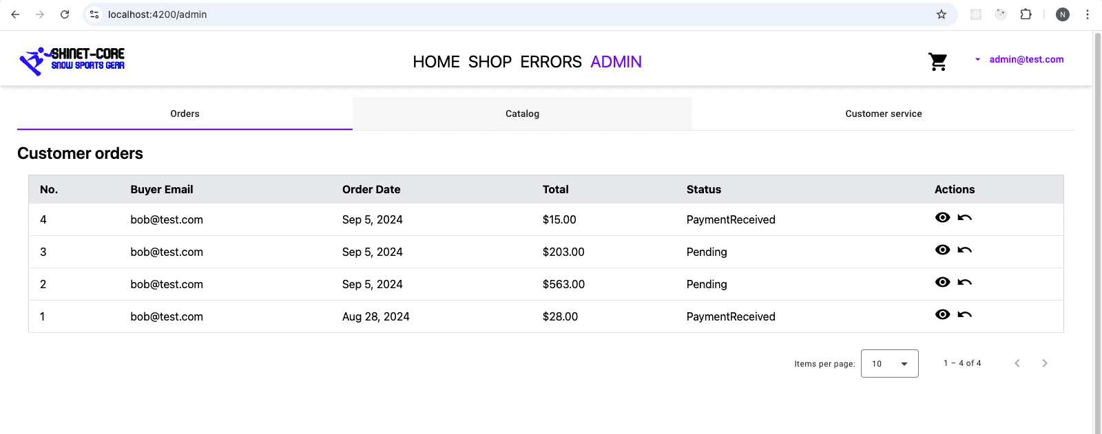
Next, we will use our new custom-table to create the admin catalog component content. Ensure the refund and view functionality still works.
Optional challenge
It would be nice if the action buttons had some color. See if you can implement button colors for the different actions.
Comments
Loading comments...